Civic Science Observer
Collecting and interpreting air quality data, and making it local

How can community journalists write good stories that are rich in scientific data and explain clearly why that data is important to the reader? One example is to look at the award-winning piece, “The Air We Breathe: Our Network of Sensors Shows How Industry is Still Polluting Cicero’s Air.”
The article, a collaborative effort between Boston-based news nonprofit MuckRock and Chicago-area newspaper Cicero Independiente, describes a multiyear effort to capture, analyze and interpret air quality data of Cicero, a town roughly eight miles west of Chicago’s center.
MuckRock’s Dillon Bergin describes the process of reporting and writing the story with Civic Science Times.
How Cicero got air quality sensors
In 2021, Microsoft announced it would be installing 100 air quality sensors around greater Chicago to measure air pollution at a level of granularity greater than the air quality monitors already installed by the U.S. Environmental Protection Agency.
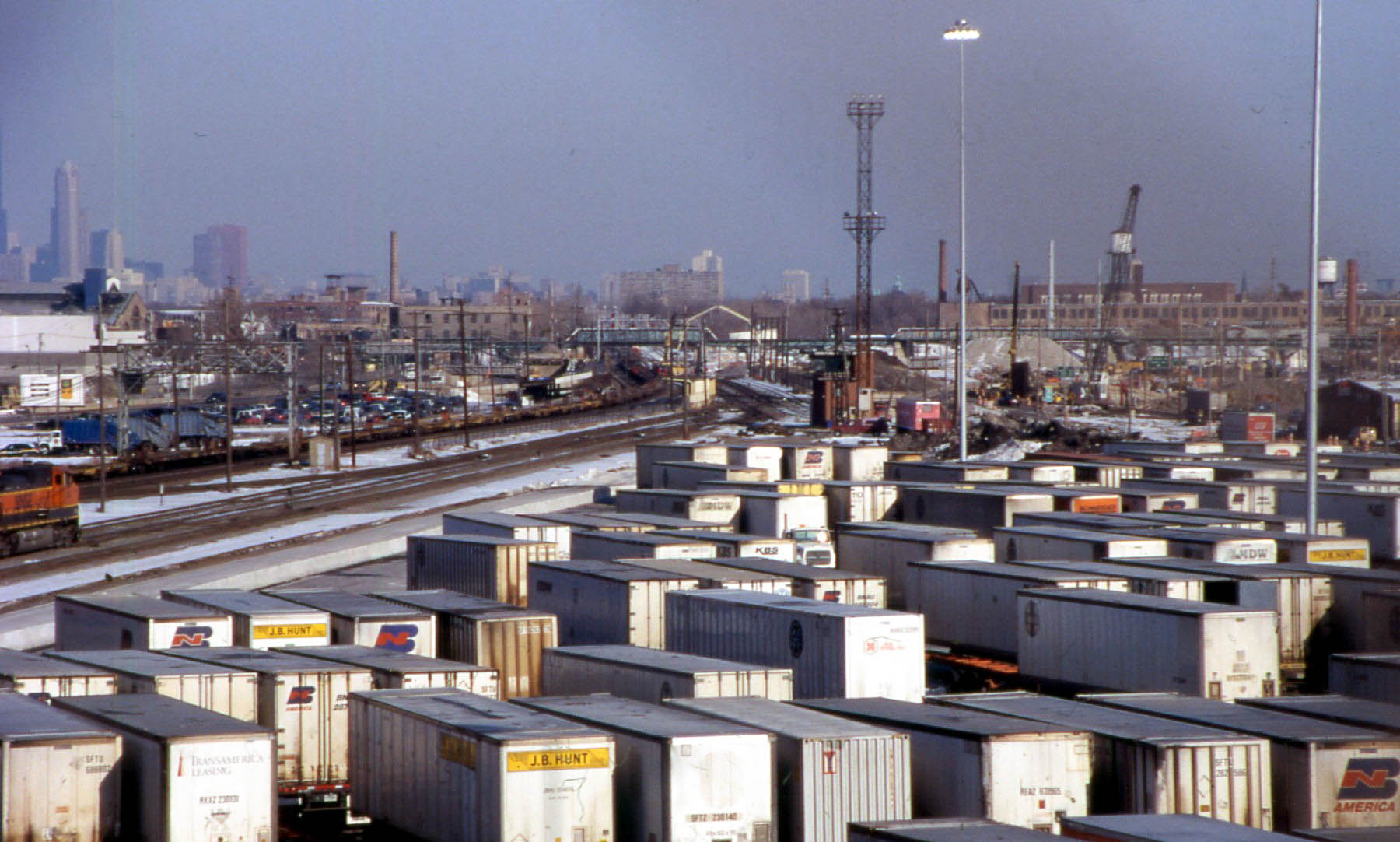
The Little Village neighborhood of Chicago received an air quality sensor, but the neighboring town of Cicero did not, at least initially. And yet, both locations faced similar demographics: the population is over 90% Hispanic or Latino, with a sizeable presence of recent immigrants. Cicero is also home to the BNSF rail yard, and it has two Amazon warehouses—meaning that Cicero was subject to transportation emissions from the railroad and from trucks going in and out of the warehouses. The town also has a coal tar plant that MuckRock says has been cited for state and federal environmental violations over the years.
When reporters for local Cicero newspaper Cicero Independiente learned about Microsoft’s air sensors, the newspaper worked with MuckRock to apply for grants to install air quality sensors of their own. Cicero already had one sensor implemented by the EPA, but the new sensors that Cicero wanted could track air quality data at a higher frequency than the EPA sensor. These sensors—PurpleAir sensors—weren’t regulatory-grade like EPA’s, but they could collect data on particulate matter as frequently as every two minutes.
Thanks to the Data-Driven Reporting Project and other grant-providing institutions such as the Rita Allen Foundation, the team eventually received sensors and installed them in three locations around Cicero. They spent a year analyzing the sensor data and comparing it with nearby sensors installed by Microsoft and the EPA.
How to report the air quality findings
Installing the air quality sensors and collecting and interpreting their data was just one element of this project.
The other main component was working with the reporting staff of Cicero Independiente to help them understand not only how to interpret the data but also how to convey the data’s findings to the broader public.
MuckRock’s Bergin, a data journalist with an investigative reporting background, worked closely with local community reporters for a year to help them understand what the air quality data meant so that the local reporters could then write about it.
“Getting them to know the meaning of the data is the most rewarding part of it. It’s always kind of a feedback loop where I do some analysis and I talk it over with a reporter, and then they say that it adds up or that doesn’t add up,” Bergin said. “Or they say, that’s really interesting. I got a tip about something like that. Then we do another round of analysis and talking it over.”
What Bergin and others looked at was comparing the air quality data from the different monitors. The EPA monitor was higher quality and more expensive, while the PurpleAir monitors were more basic. However, the EPA monitor and the PurpleAir monitors were showing different air quality readings. That was because the EPA monitor made one reading only once a day or every few days, while the PurpleAir monitors measured air quality every five minutes or 15 minutes.
“That doesn’t necessarily mean either sensor is wrong,” Bergin said. Rather, the data discrepancy supports the argument “why more local air quality monitoring should be done, because you can’t see the little changes in air quality from a full day of Amazon trucks and industrial pollution if you’re not measuring at that spatial regularity or time granularity.”
Bergin also worked with Cicero reports on how to publish data. They found that one of the best ways for the public to understand the data was to do so visually.
The team worked with a graphic illustrator at Chicago’s public radio station WBEZ to make a graphic illustration of fine particles, also known as particulate matter (PM) 2.5.
“Most people will read PM2.5 and it’ll go over their head. So, we did this really cool graphic illustration article where we showed, ‘this is the size of particulate matter 2.5 and it’s as big a hair,’” Bergin said. “We can think about who that reader is and what their need is and what their general knowledge will be coming to the story.”
They also worked with a local Cicero artist to develop several poster boards illustrating key points of the findings. The team lined up the poster boards at a public space on a weekend and held a gallery walk where community members could come and ask questions.
The public viewing of the posterboards was also good for the team because they learned that they couldn’t just write about the results but that they also had to write about actionable steps, according to Bergin. He was told by a local reporter attending the event that an older woman, who had lived in the area for a long time, came up and asked what residents could do to address the issue of poorer air quality.
“There was a need to develop a more solutions-oriented journalism piece so that people could see that this is what can be done. This is not a problem that can’t be solved. It’s not good or healthy for you to be breathing, but here’s is what’s possible. So we would try to incorporate that,” Bergin said. It also meant following up on tips that local residents gave by investigating and reporting on facilities that might be contributing to the poorer air quality, he continued.
That solutions-oriented framework eventually helped the piece earn multiple awards. In September, the team received the Victor K. McElheny Award at the Massachusetts Institute of Technology for local and regional journalism. The final piece was also one of the recipients of the 2024 New America Award from the Society of Professional Journalists for public service journalism exploring issues affecting immigrant or ethnic communities.
“I feel like a lot of times we do serve as that go between. The final goal is to take this data from this research or this lab or group of scientists and help local reporters use it to do more nuanced reporting or more difficult reporting. That’s always, I think, the goal,” Bergin said.
Joanna Marsh is a freelance writer and journalist based in Washington, D.C. For The Civic Science Observer, she reports on new developments across the citizen science landscape, covering both new research and on-the-ground practice. Her work highlights how local communities are engaging with scientists to contribute to ongoing scientific research and lessons being learned by the involved stakeholders.

Contact
Menu
Designed with WordPress


